╱
3M
・
・
2015
Complex safety technology made readable in the field.

╱
3M
・
・
2015
Complex safety technology made readable in the field.
Client
3M
solutions
Brand
year
2015
industry
Products / Packaging
╱
Overview
The Brief
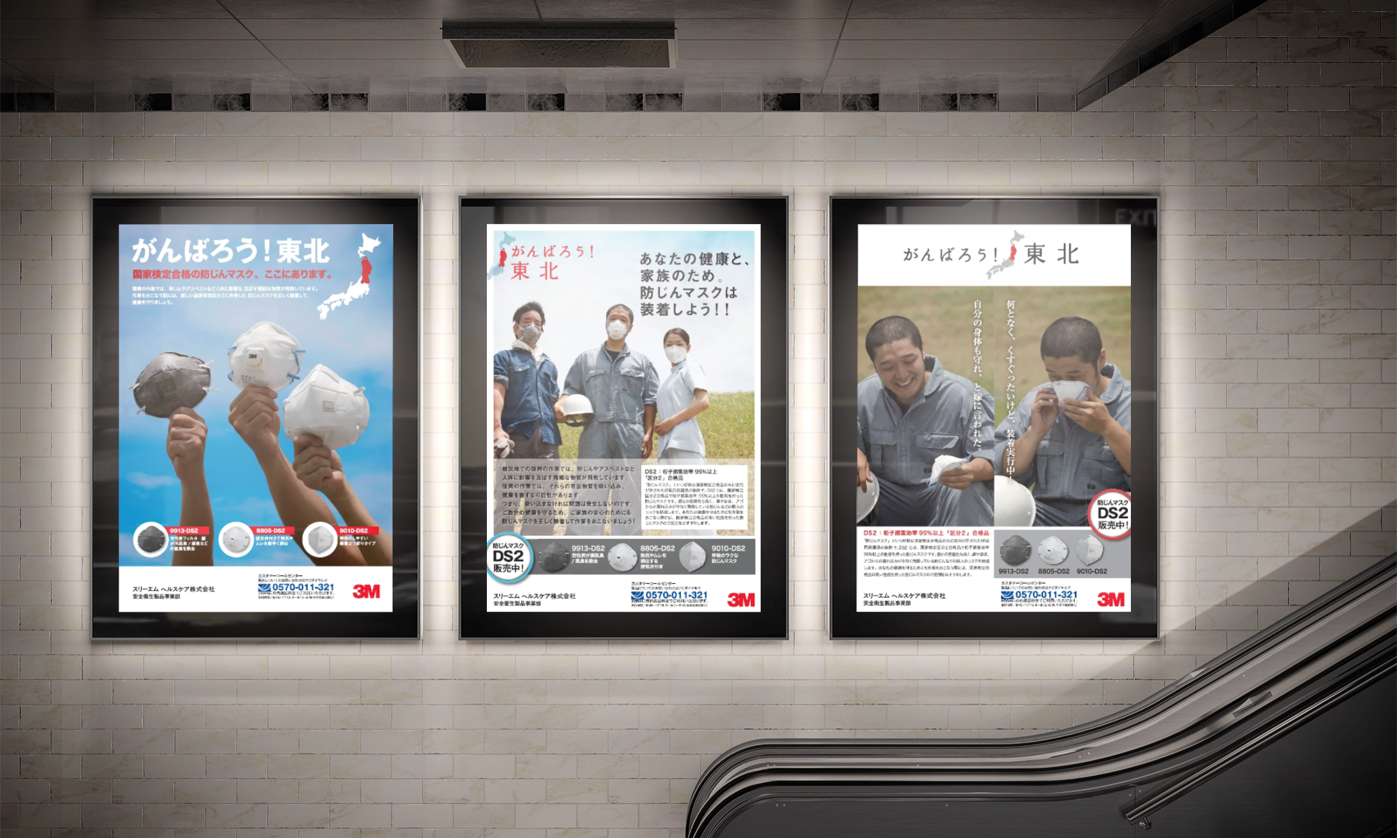
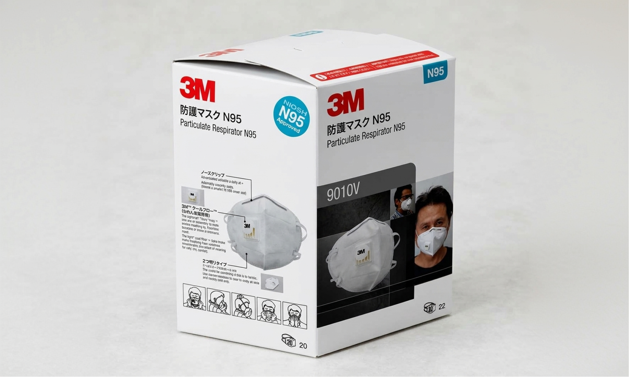
3M Japan partnered with us to translate complex worker-safety and earthquake-resilience technologies into clear, standards-compliant print communications. We designed an information architecture and localized copy that made high-density technical guidance easy to navigate across brochures, catalogues, posters, and product sheets—without compromising 3M’s global visual standards.
╱
challenge ・transformation ・impact
01
Challenge
3M Japan's worker safety and earthquake-resilience technologies are genuinely complex, and complexity in print communications either loses the reader or loses the point. The materials needed to stay standards-compliant while becoming clear and field-ready.
02
Tranformation
YF designed an information architecture and layout system for promotional posters, product brochures, and data sheets, with infographic structures and copywriting built to make technical safety content scannable and immediately useful in the field.
03
Impact
3M Japan gained a cohesive print communication system that translated complex safety and earthquake-proofing information into clear, field-ready guidance. The standards-aligned design strengthened the brand's authority signal while making the materials genuinely easier to act on.
╱
SELECTED STILLS
Tell us where your brand and your business stopped growing together.

よろしくファンタスティック株式会社
Yoroshiku Fantastic K.K. — Tokyo, Japan